Jan 10 2025
Itel: AI Insurance Sample Handling
I was the principal UX/UI designer and researcher of two separate AI-powered Windows touchscreen applications that detect, identify, and process samples for insurance claims, serving major companies from Allstate to State Farm.
The first application, Project "Titan," identifies provided housing samples using three cameras. The application would eventually be embedded into the new receiving station application (Project "Receiving"), where samples are either sorted for further lab analysis or prepared for shipping.
Project "Titan"
This project began by identifying the hardware and experience necessary for users to place samples for AI identification. Minimizing user error and maximizing user control were non-negotiable. I designed movable and non-movable portions of the workstation to eliminate unnecessary complexity. Camera positioning and lighting were also critical for achieving the most accurate AI detection possible.
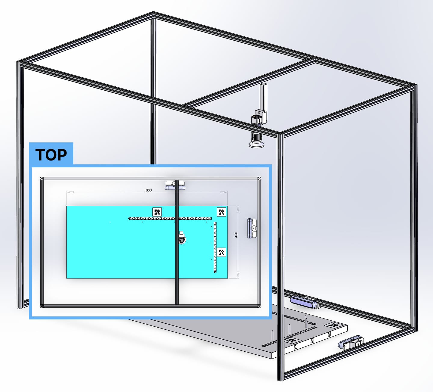
After numerous iterations and reviews with stakeholders—including the CTO, product team, developers, and lab workers—I developed a universally approved low-fidelity prototype.
Rapid iteration allowed us to uncover and solve hidden complexities early, before moving into high-fidelity design or development. Walking through each workflow step-by-step with stakeholders multiple times prevented expensive rework later.
Since this was a Windows touchscreen application, I used Microsoft’s official Windows Figma file to build a tailored, native-feeling design system. Custom components were only created when absolutely necessary, keeping development overhead low while ensuring the application felt as polished and intuitive as any first-party Windows app.
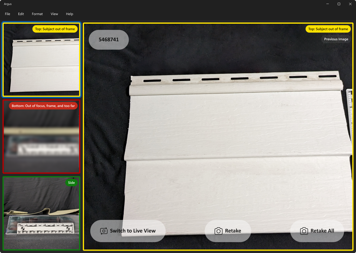
The initial screen showed live feeds from three cameras on the left and a larger focus view on the right, where users could view sample information and capture all three images simultaneously with a single button.
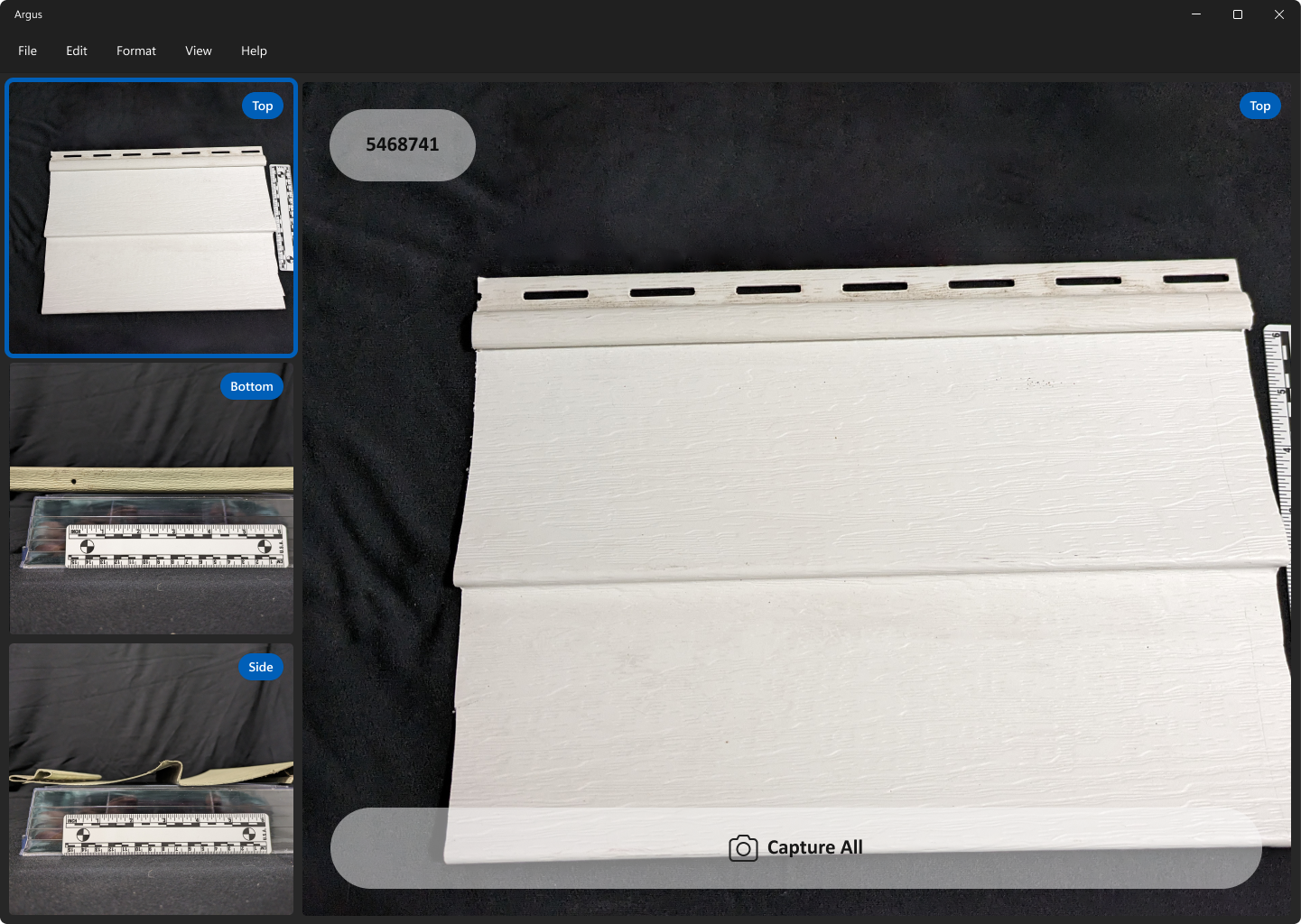
After tapping "Capture All," users would move to the verification step. Here, the AI detection would rate each image as a pass (green), soft fail (yellow), or hard fail (red).
The AI evaluated focus, positioning, and object recognition. Users could toggle between captured images and live camera feeds to re-capture images until all passed.
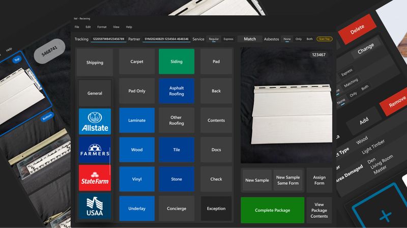
Project "Receiving"
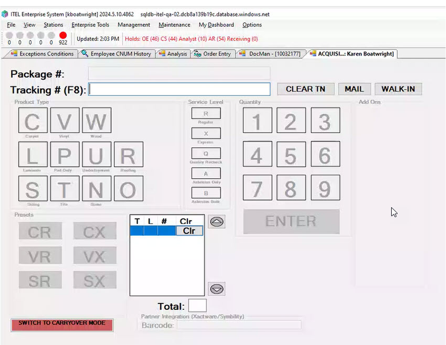
The second application, Project "Receiving," modernized a legacy Windows touchscreen system that was riddled with issues: poorly labeled controls, unclear error messaging, inefficient layouts, and confusing navigation.
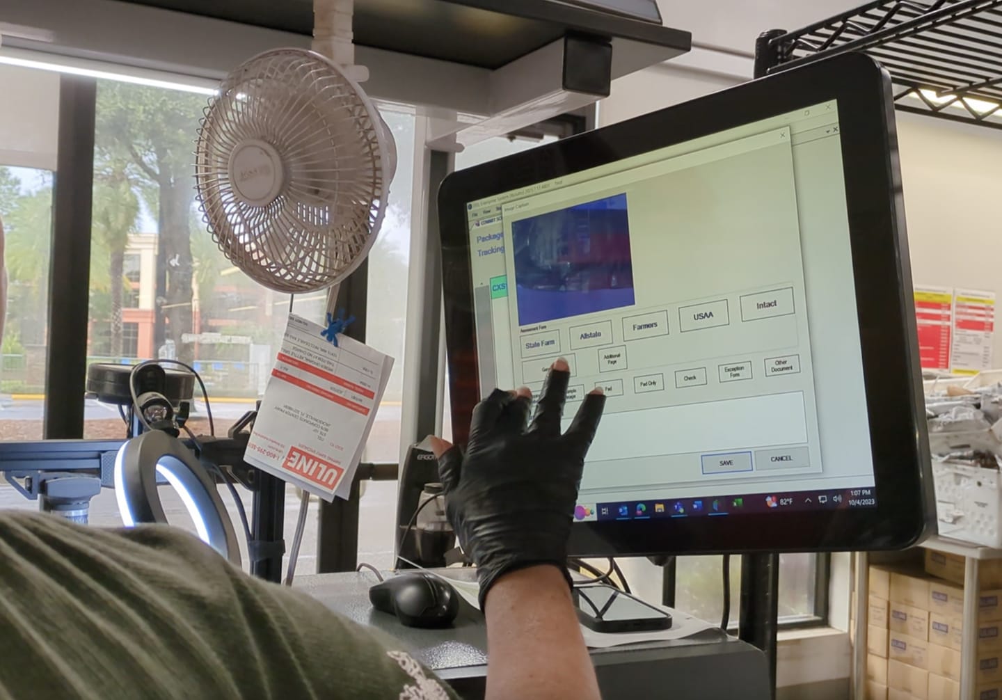
The biggest challenge was navigating around the inflexible legacy codebase. Collaborating closely with developers, architecture, product teams, and upper management, we finalized the most optimal user flow possible within these constraints.
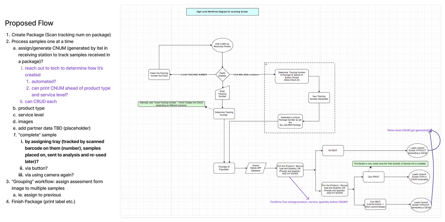
Once the new flow was locked, I iterated on the design, working hand-in-hand with product managers and developers to adjust for new insights and technical obstacles.
Again, using Microsoft’s official Windows Figma file and building upon custom components from Project Titan, I created a seamless initial experience that significantly reduced learning curves and development effort.
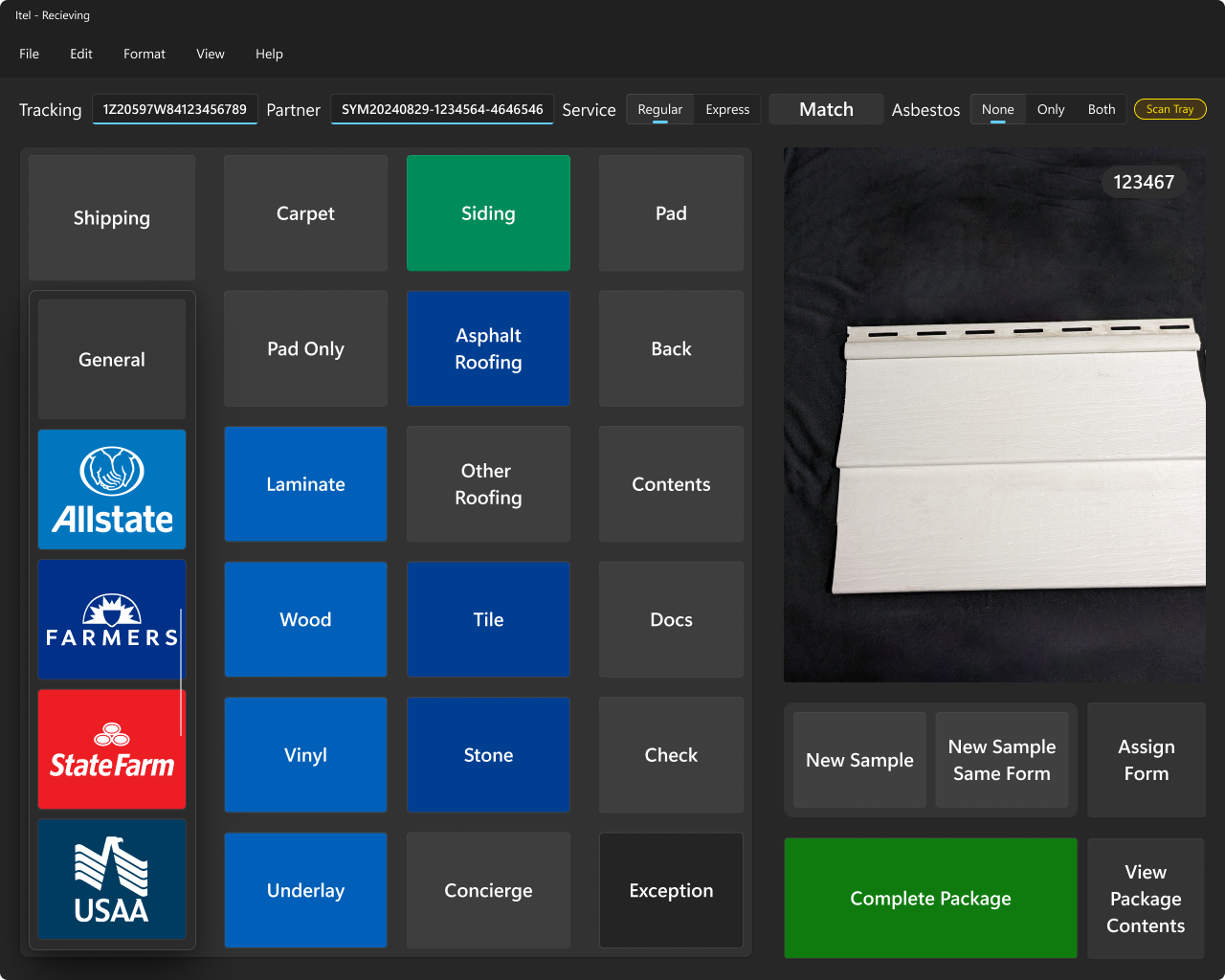
This screen allowed users to identify the insurance provider, forms, sample types, and properties, while also packaging and tagging the samples, all with a live camera feed for verification.
Key design principles I established included:
- Most-used actions placed closest to the user (left side) to reduce time-to-target and minimize physical effort
- Insurance brand identification and functional weight communicated through color coding
- Clear visual grouping of related controls
- Scrollable areas always showed a visible scrollbar to hint at additional controls
- Primary identifying information and controls always at the top
- Adherence to Windows-native language and navigation patterns
- Control size and visual weight scaled according to frequency and importance of use
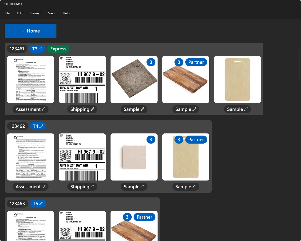
The next major screen displayed all added samples, their associated shipping and lab tray assignments, and allowed users to view or edit related images and documentation. Again, scrollbars were persistently visible to make overflow obvious and intuitive.
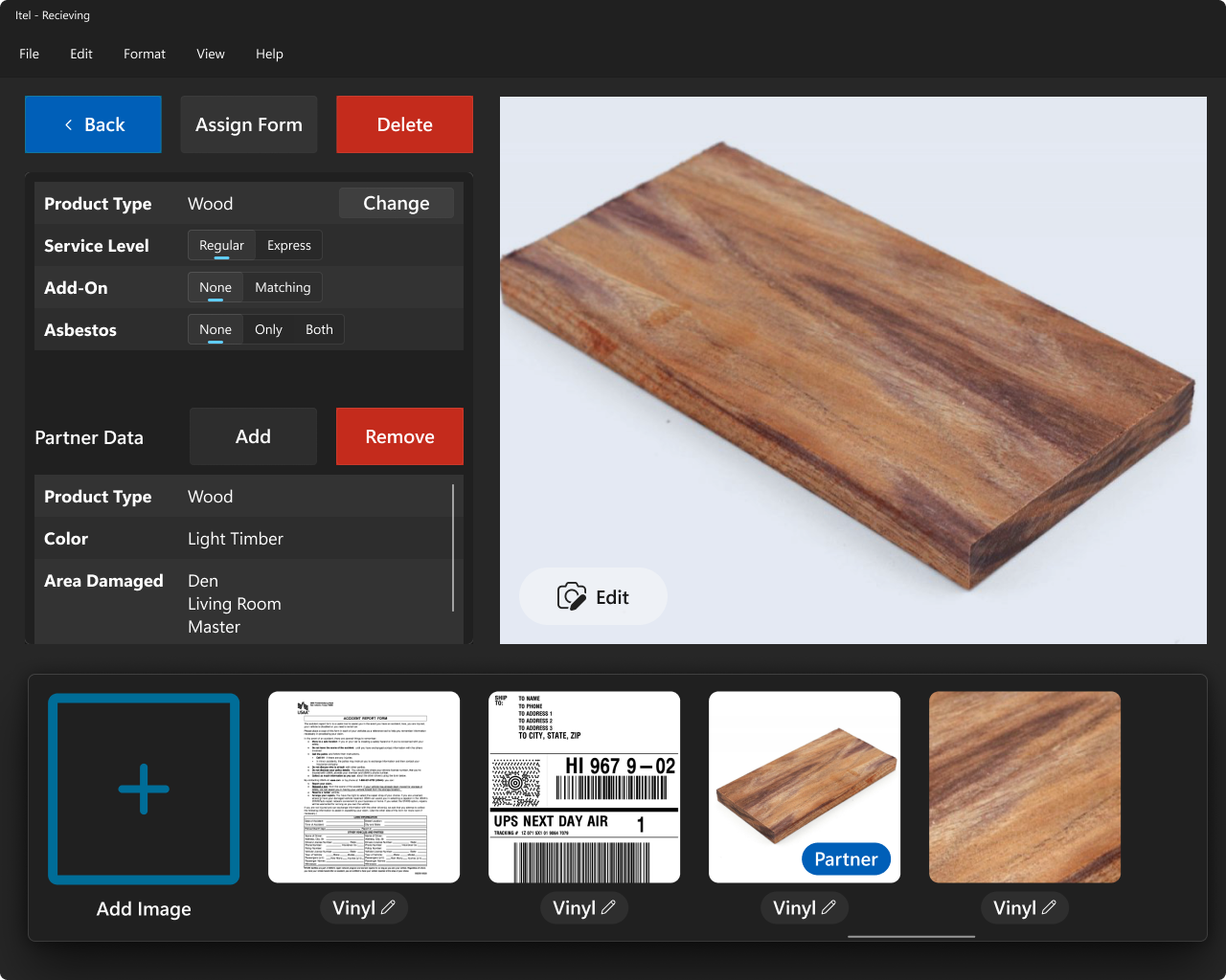
Finally, the product management screen enabled users to manage individual samples and associated assets, including the ability to edit, view, or delete information.
Conclusion
By leading the UX/UI design for both Project Titan and Project Receiving, I helped modernize critical insurance claim workflows with precision, efficiency, and a native Windows experience. I eliminated costly user errors, streamlined convoluted processes, and built intuitive systems that scaled easily for developers. Working within real-world legacy and hardware constraints, I proved that deep stakeholder collaboration, rapid iteration, and strict design principles can still produce modern, high-impact software — even in industries notorious for technical debt.