I'm a specialist that brings entire digital products to life on my own or on a team. I apply a science and data backed cycle of research, design, development of code and content, and testing.
Research
Understanding the problem is where it all starts. Analyzing and defining users and their needs lays the foundation. The insights uncovered inform ideation and shape the product's final design.
FigJamJiraNotionSWOTCard SortingCompetitor AnalysisStakeholder InterviewsSurveysUser InterviewsAnalytics AnalysisUser Personas
Design
Low-fidelity prototypes are created and iteratively tested with users to identify pain points and improve workflows. Once validated, high-fidelity designs are developed, incorporating branding, accessibility, and visual consistency.
I develop complete digital products or UI prototypes for handoff to other developers. I adapt to existing platforms or select a new platform to build a product on. I leverage separate environments and version control systems to keep everything organized and functional.
Interactive prototypes are tested for usability, and feedback is implemented before handoff to developers, or I begin development myself. I work with QA to resolve any final bugs before launch, or if I'm acting as QA, I leverage Litmus to conduct rigorous testing across devices and applications.
Post-launch, I return to analytics and user feedback, guiding continuous optimization to ensure the design evolves with user needs.
Google AnalyticsHot JarLitmusPendoUserTesting.comA/B TestingAnalytics AnalysisQAUser Testing
Jan 10 2025
Itel: AI Insurance Sample Handling
I was the principal UX/UI designer and researcher of two separate AI-powered Windows touchscreen applications that detect, identify, and process samples for insurance claims, serving major companies from Allstate to State Farm.
The first application, Project "Titan," identifies provided housing samples using three cameras. The application would eventually be embedded into the new receiving station application (Project "Receiving"), where samples are either sorted for further lab analysis or prepared for shipping.
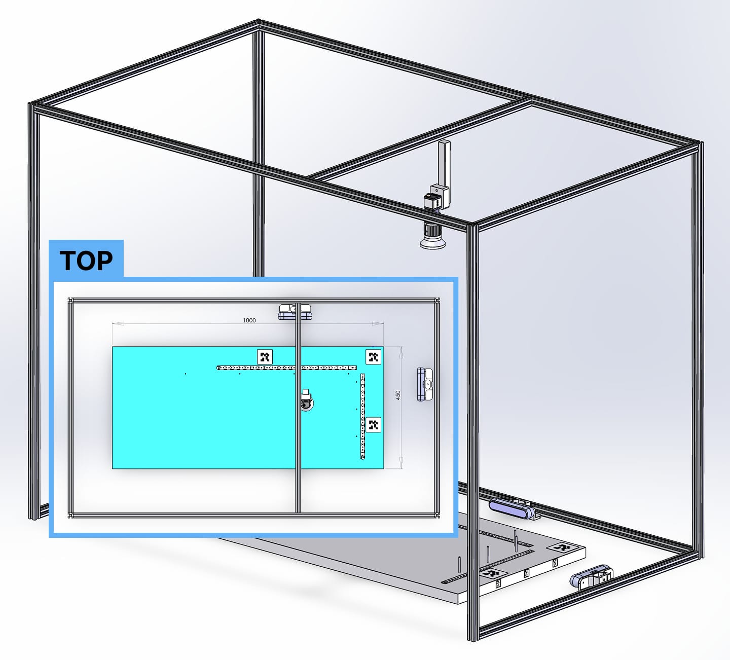
Project "Titan"
This project began by identifying the hardware and experience necessary for users to place samples for AI identification. Minimizing user error and maximizing user control were non-negotiable. I designed movable and non-movable portions of the workstation to eliminate unnecessary complexity. Camera positioning and lighting were also critical for achieving the most accurate AI detection possible.
Desk structure final from CAD
After numerous iterations and reviews with stakeholders—including the CTO, product team, developers, and lab workers—I developed a universally approved low-fidelity prototype.
Rapid iteration allowed us to uncover and solve hidden complexities early, before moving into high-fidelity design or development. Walking through each workflow step-by-step with stakeholders multiple times prevented expensive rework later.
Lo-fi from Figjam (Figma)
Since this was a Windows touchscreen application, I used Microsoft’s official Windows Figma file to build a tailored, native-feeling design system. Custom components were only created when absolutely necessary, keeping development overhead low while ensuring the application felt as polished and intuitive as any first-party Windows app.
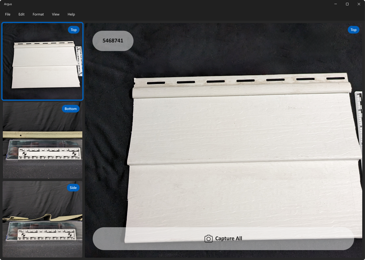
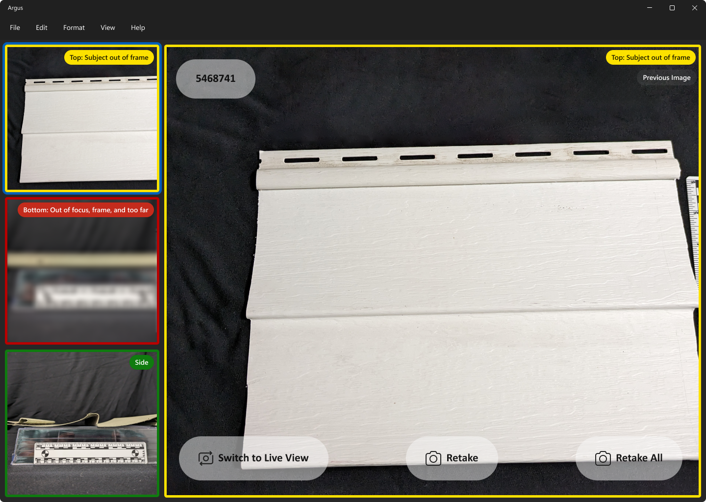
The initial screen showed live feeds from three cameras on the left and a larger focus view on the right, where users could view sample information and capture all three images simultaneously with a single button.
Initial screen showing user all three camera views
After tapping "Capture All," users would move to the verification step. Here, the AI detection would rate each image as a pass (green), soft fail (yellow), or hard fail (red).
The AI evaluated focus, positioning, and object recognition. Users could toggle between captured images and live camera feeds to re-capture images until all passed.
Verification screen showing AI evaluation of photos
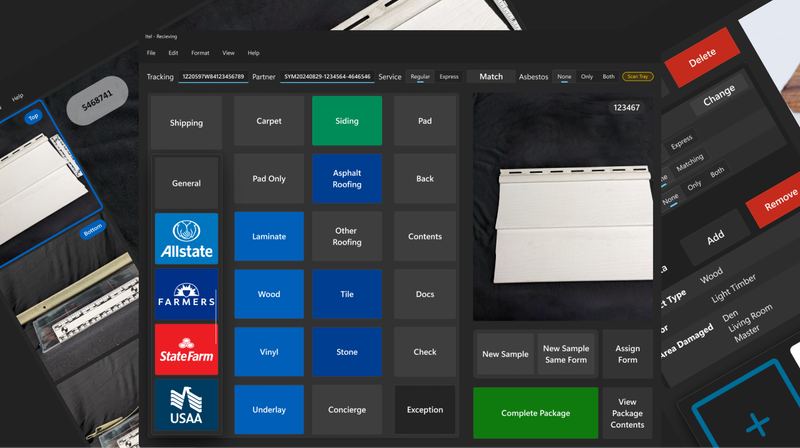
Project "Receiving"
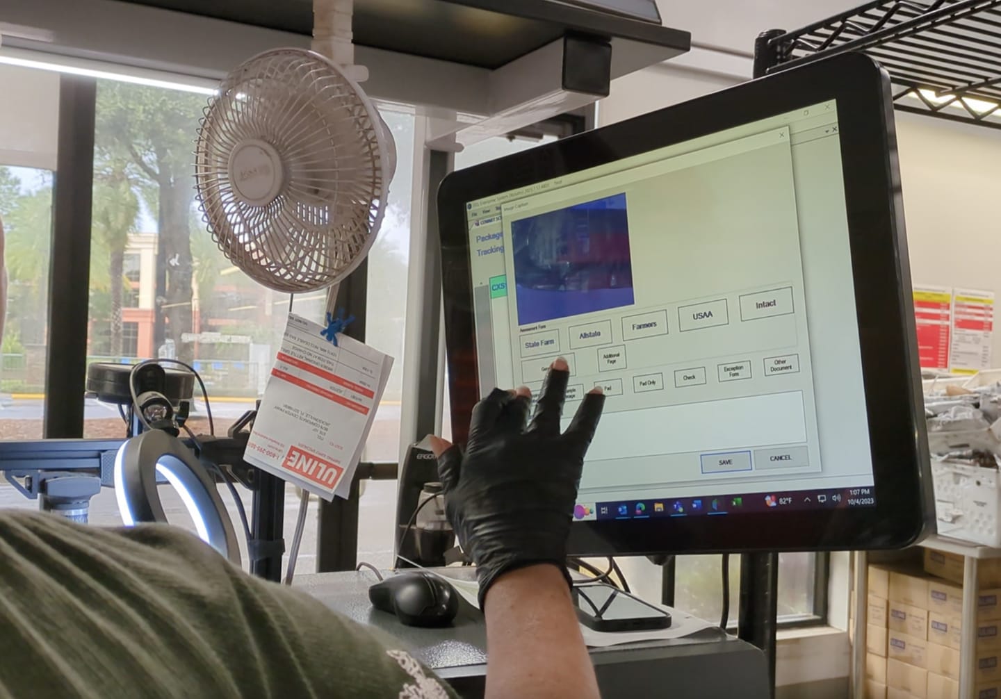
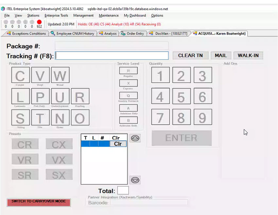
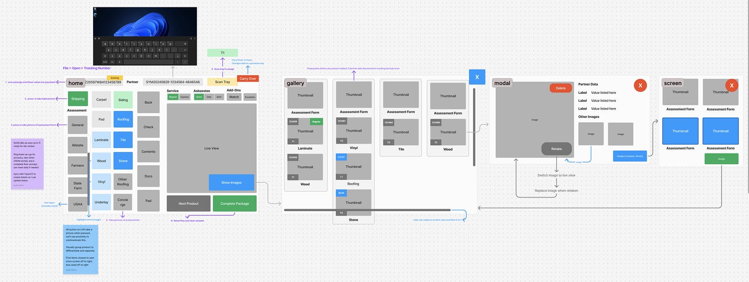
The second application, Project "Receiving," modernized a legacy Windows touchscreen system that was riddled with issues: poorly labeled controls, unclear error messaging, inefficient layouts, and confusing navigation.
User tapping legacy system at work stationLegacy system initial screen
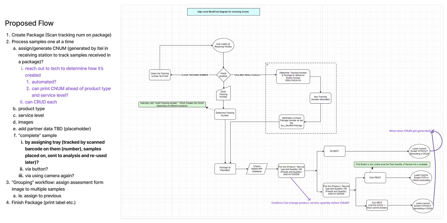
The biggest challenge was navigating around the inflexible legacy codebase. Collaborating closely with developers, architecture, product teams, and upper management, we finalized the most optimal user flow possible within these constraints.
Existing programmatic flow and it's proposed updates
Once the new flow was locked, I iterated on the design, working hand-in-hand with product managers and developers to adjust for new insights and technical obstacles.
Lo-fi for primary user flow in Figjam (Figma)
Again, using Microsoft’s official Windows Figma file and building upon custom components from Project Titan, I created a seamless initial experience that significantly reduced learning curves and development effort.
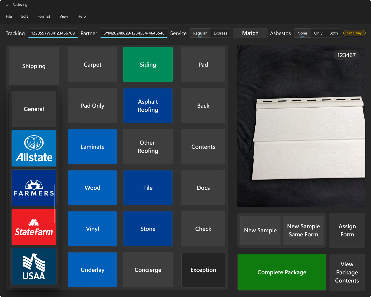
Initial user touchscreen
This screen allowed users to identify the insurance provider, forms, sample types, and properties, while also packaging and tagging the samples, all with a live camera feed for verification.
Key design principles I established included:
Most-used actions placed closest to the user (left side) to reduce time-to-target and minimize physical effort
Insurance brand identification and functional weight communicated through color coding
Clear visual grouping of related controls
Scrollable areas always showed a visible scrollbar to hint at additional controls
Primary identifying information and controls always at the top
Adherence to Windows-native language and navigation patterns
Control size and visual weight scaled according to frequency and importance of use
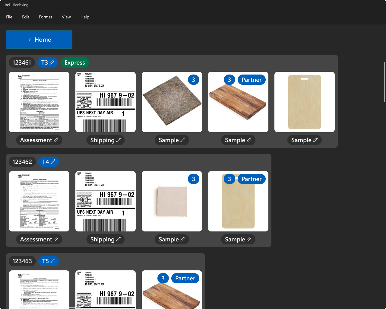
The next major screen displayed all added samples, their associated shipping and lab tray assignments, and allowed users to view or edit related images and documentation. Again, scrollbars were persistently visible to make overflow obvious and intuitive.
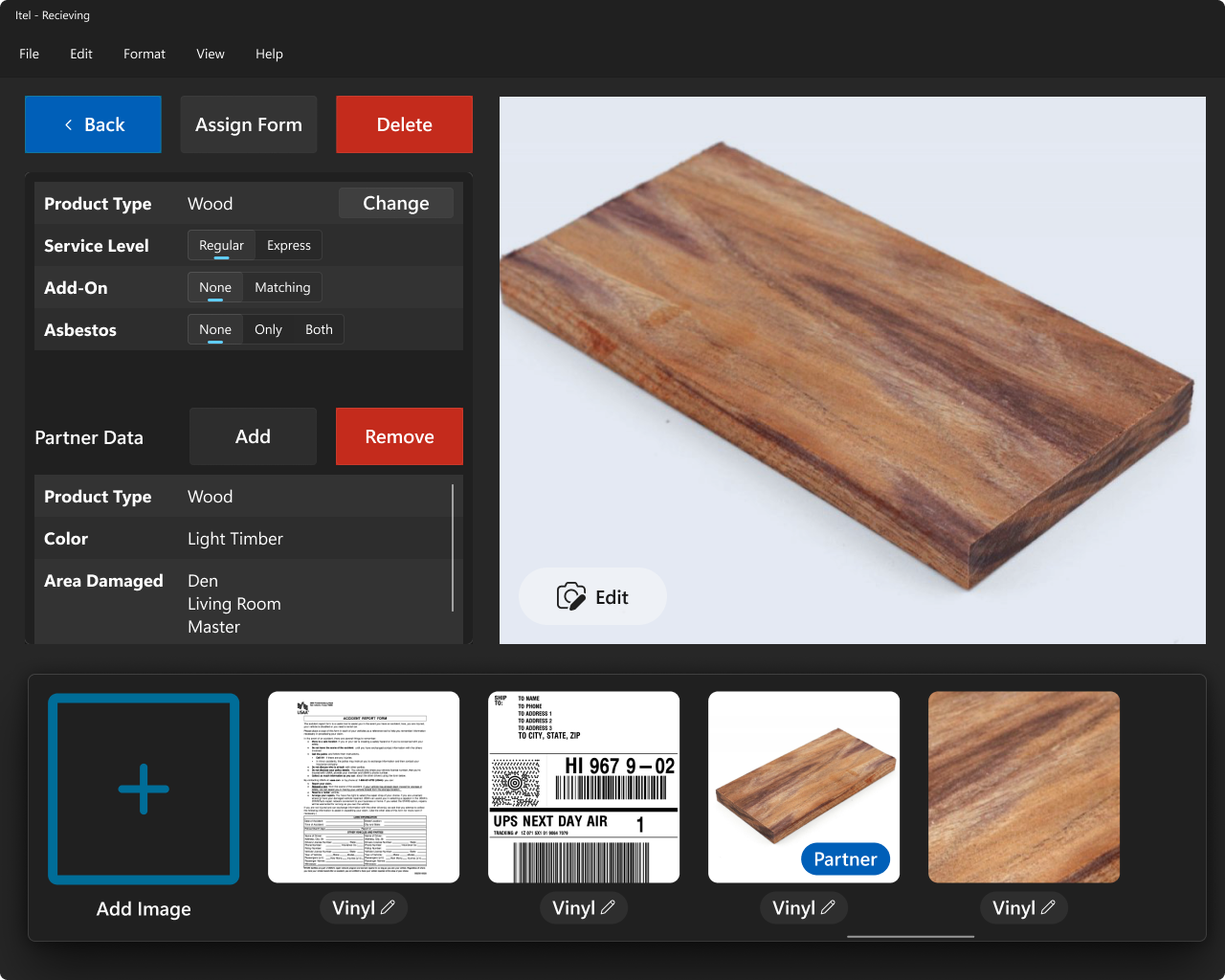
Finally, the product management screen enabled users to manage individual samples and associated assets, including the ability to edit, view, or delete information.
Product management screen
Conclusion
By leading the UX/UI design for both Project Titan and Project Receiving, I helped modernize critical insurance claim workflows with precision, efficiency, and a native Windows experience. I eliminated costly user errors, streamlined convoluted processes, and built intuitive systems that scaled easily for developers. Working within real-world legacy and hardware constraints, I proved that deep stakeholder collaboration, rapid iteration, and strict design principles can still produce modern, high-impact software — even in industries notorious for technical debt.
Jan 01 2024
SpendHQ: AI Powered Dashboards for Fortune 500s
Achieving a 30% ROI, I led a complete UX/UI transformation, implementing scalable systems, redesigning workflows, and delivering a user-focused, modern interface.
SpendHQ is an AI-powered spend intelligence platform designed to help Fortune 500 companies including Pepsi and Under Armour optimize their spending, diversity, clean energy, and diversity by integrating supplier and third-party data. Before my involvement, the platform suffered from a dated and inconsistent user experience that frustrated users and limited engagement.
Increased Net Promoter Score (NPS) by 133%
Boosted product stickiness by 125%
Extended average session times by 50%
Redesigned over 200 screens
Challenges
SpendHQ faced several challenges when I joined the team. The platform's design was outdated and fragmented, leading to cognitive overload and inefficiencies for users. The organization lacked user feedback documentation, analytics tools, and research artifacts, making it difficult to identify and address user pain points effectively.
The user base was diverse, ranging from financial analysts to C-suite executives, each requiring tailored solutions to meet their unique needs. Additionally, the absence of established design systems or workflows created inefficiencies in collaboration and development.
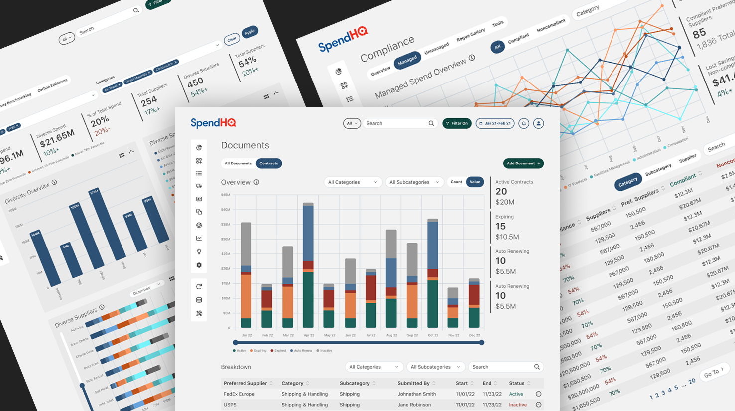
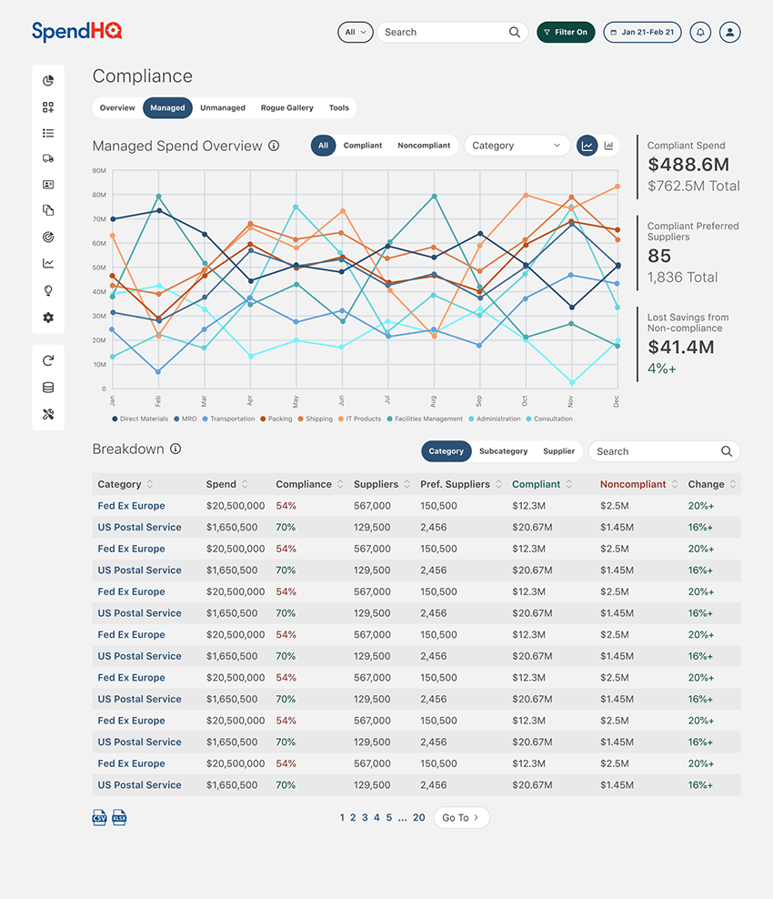
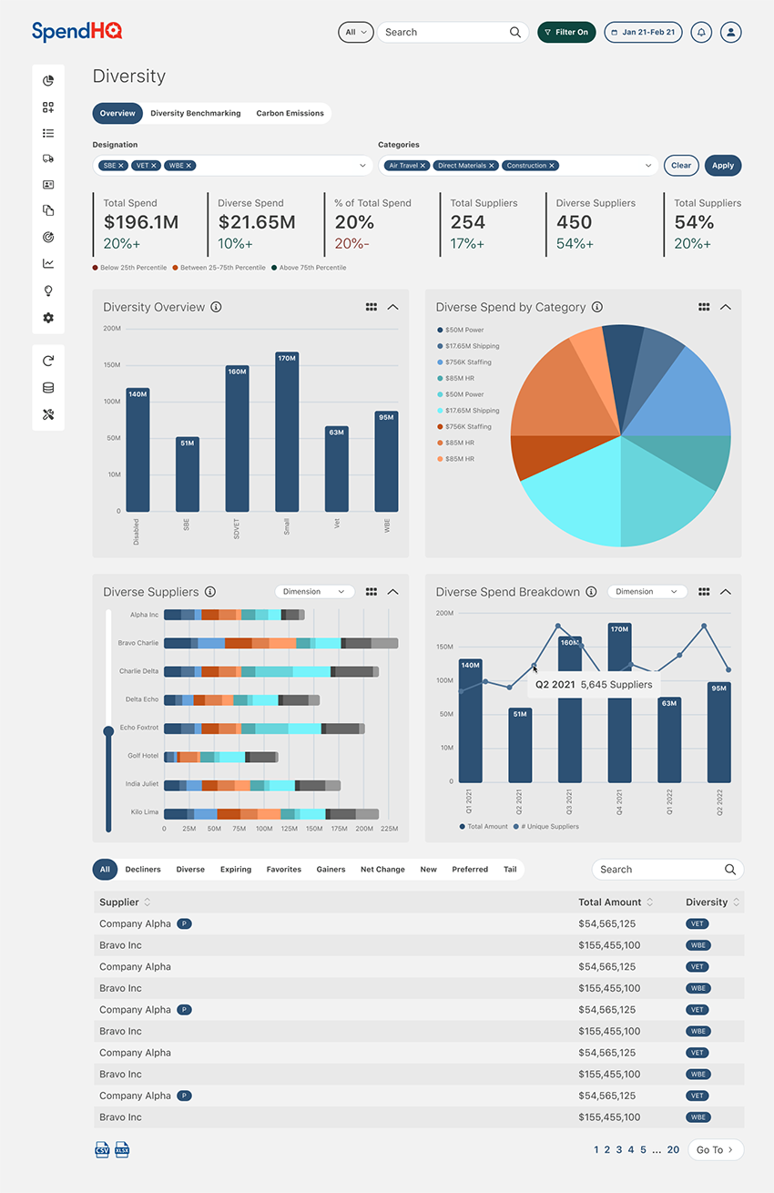
Compliance Mock-up
My Approach
To address these challenges, I established a data-driven foundation by implementing tools like Pendo and Hotjar to track user behavior, including NPS scores, retention rates, and heatmaps. These analytics were complemented by competitive research, user interviews, and testing, providing a comprehensive understanding of user needs. I collaborated with the head of product to develop four key user personas, representing users from technical analysts to executives, and mapped detailed user flows using FigJam to align workflows with business objectives.
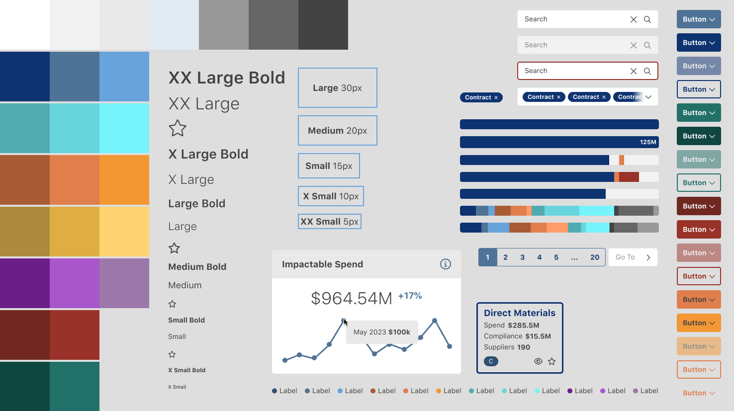
Building a scalable design system was a critical component of the redesign. I created a comprehensive Figma ecosystem, incorporating atomic design principles to develop reusable components and centralized design files. This system supported both the current app and the redesigned interface, streamlining collaboration and iteration. To foster collaboration across teams, I facilitated workshops with stakeholders, product owners, and developers, aligning priorities and accelerating the iterative design process.
Design System Assets
Solutions
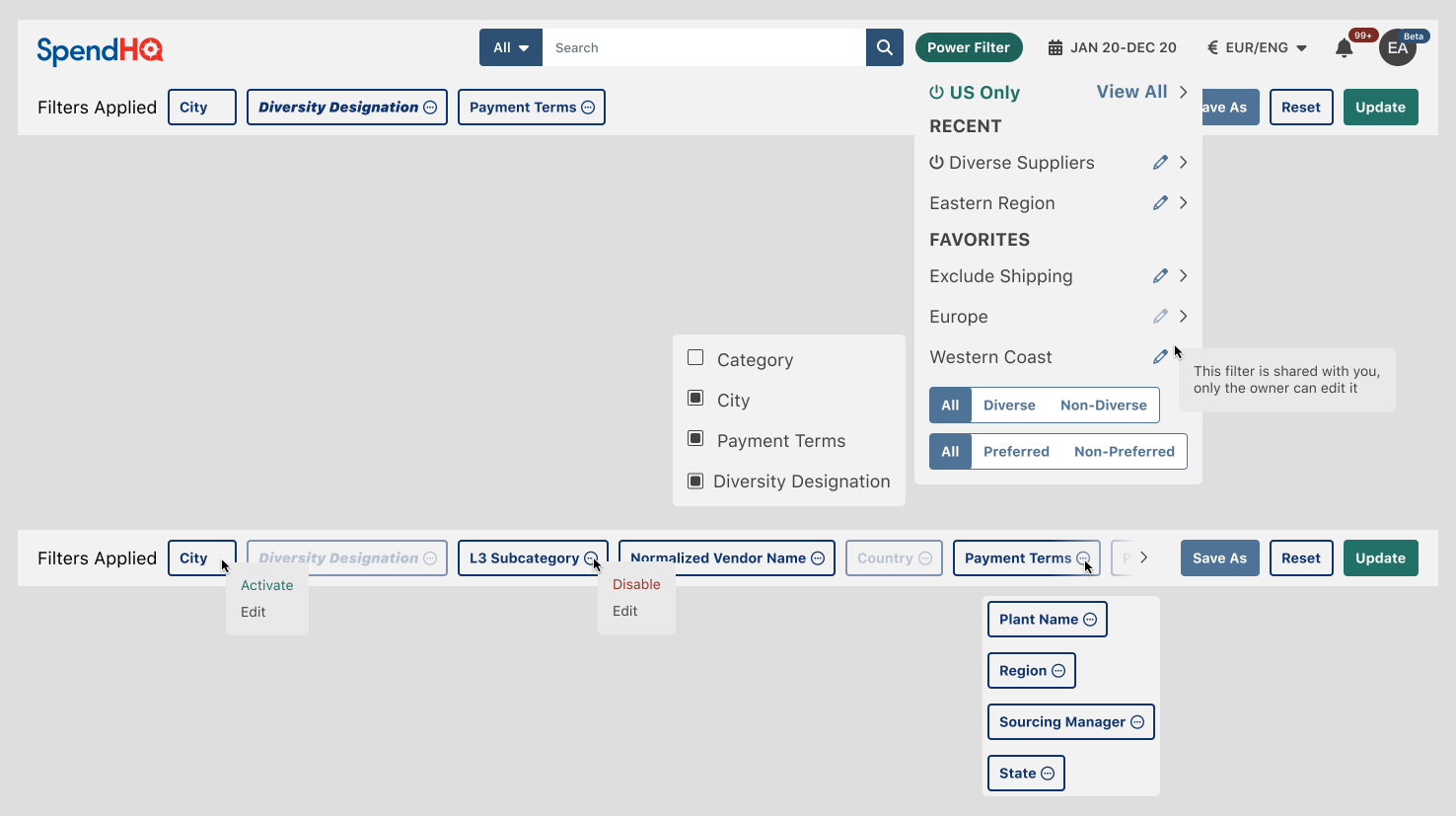
One of the most impactful solutions was the redesign of the "Power Filter," a global filtering tool used to refine data across all screens. I transformed this feature into an accessible, modular header component, replacing the overly complex and disjointed workflow. This redesign was validated through hi-fi prototypes and user testing, resulting in significantly faster task completion rates and higher satisfaction.
I also delivered a cohesive reskin and UX optimization, standardizing UI components across over 100 screens to reduce cognitive overload and ensure consistency. To address user confusion, I designed and integrated a comprehensive help system, including contextual pop-overs and dedicated documentation sections, which improved onboarding and reduced support inquiries. Additionally, I developed interactive prototypes to gather actionable feedback and avoid unnecessary development time, saving hundreds of hours across the project.
Power Filter Header Components
Key Takeaways
Leading SpendHQ’s transformation involved establishing scalable design processes, leveraging data-driven insights, and fostering cross-functional collaboration. By prioritizing user needs and aligning them with business goals, I delivered a modern, intuitive platform that significantly improved engagement, satisfaction, and scalability. The project not only enhanced the experience for SpendHQ’s users but also set a strong foundation for ongoing development and innovation.
Diversity Mock-up
Nov 01 2020
NASCAR: New Websites for Mexico, ARCA & Sebring
Achieving a 40% ROI, I brought expertise in WordPress development and UX/UI design to build new websites, enhance existing ones, and ensure seamless functionality during live events.
NASCAR, the premier stock-car racing sanctioning body in North America, oversees some of the most iconic racing events in the world. As part of a restructuring effort, NASCAR transitioned from third-party development teams to internal teams for creating and maintaining their digital properties.
Launched the NASCAR Mexico, ARCA Menards, and Sebring Raceway websites.
Enhanced user experience and functionality for NASCAR.com and IMSA.com.
Provided live support for digital race experiences, ensuring uninterrupted service during high-traffic events.
Bridged design and development gaps by facilitating collaboration between developers, designers, and product teams.
Challenges
NASCAR’s transition to internal teams created several hurdles. repurposed developers new to PHP and WordPress were tasked with building custom WordPress sites, while graphic designers with limited UX/UI experience were responsible for creating digital experiences.
This mismatch in expertise led to challenges in execution and collaboration. Additionally, the organization required high-performing digital platforms to support real-time race updates, which demanded seamless integration between design and development. NASCAR’s custom WordPress framework added further complexity, requiring precise modifications to themes and plugins to meet both user and business needs.
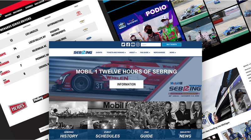
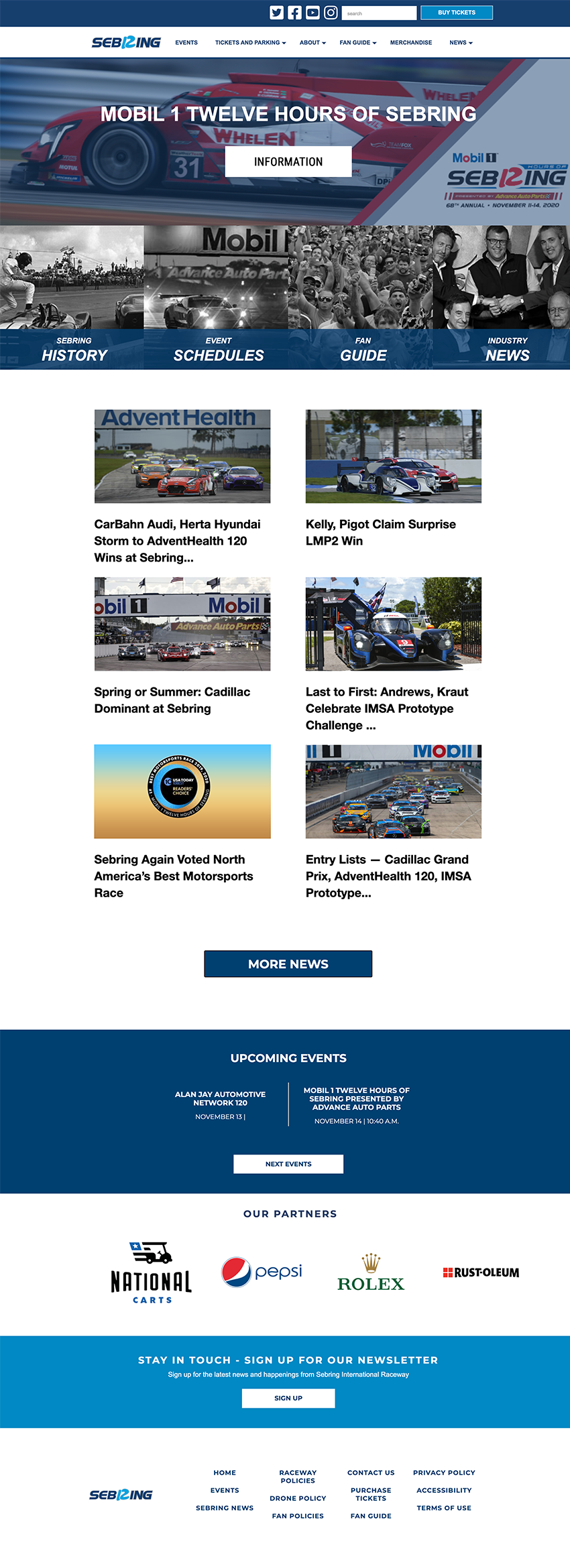
Sebring Raceway New Website
My Approach
To address these challenges, I began by participating in creative briefings with product managers and graphic designers to review research findings and project goals. These sessions informed design decisions and ensured that all modifications adhered to industry-standard UX/UI principles, accessibility guidelines, and the execution constraints of NASCAR’s custom WordPress framework. By analyzing site designs, I provided actionable feedback on development feasibility, aligning design intent with technical realities.
During development, I worked independently on projects such as the NASCAR Mexico, ARCA Menards, and Sebring Raceway websites. Each site required custom modifications to NASCAR’s WordPress themes and plugins, which I implemented while maintaining scalability and usability. To ensure efficient progress tracking, I used Atlassian Jira to document updates, manage tasks, and address QA feedback.
In addition to building new websites, I provided enhancements to existing platforms, such as NASCAR.com and IMSA.com, improving user experience and addressing technical issues. I was also responsible for live monitoring and issue resolution during high-traffic race weekends. Working from NASCAR headquarters in Charlotte, NC, I collaborated with live ops teams to resolve real-time issues, such as lap-time reporting errors, ensuring uninterrupted service during critical events.
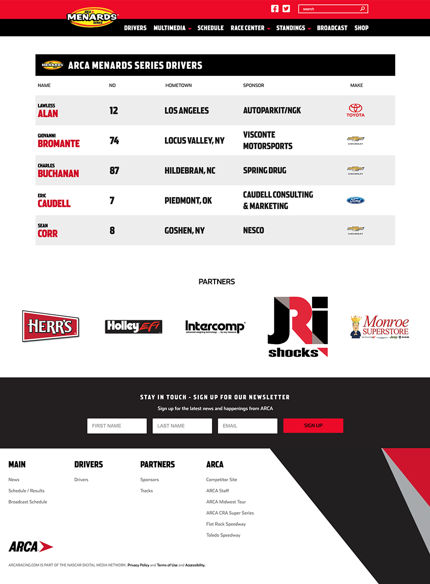
ARCA Menards New Drivers Webpage
Solutions
One of my primary contributions was delivering three major new websites: NASCAR Mexico, ARCA Menards, and Sebring Raceway. These platforms were built from the ground up, incorporating responsive designs, modern UX/UI principles, and accessibility standards. I also enhanced NASCAR.com and IMSA.com, making UX/UI improvements and resolving technical challenges to ensure optimal performance.
Another key solution was bridging the gap between designers and developers. By providing UX/UI guidance and ensuring compatibility with the custom WordPress framework, I streamlined the collaboration process, enabling efficient execution of projects. Additionally, I played a pivotal role in NASCAR’s live digital operations, quickly addressing technical issues during live races, such as resolving errors in real-time lap-time reporting.
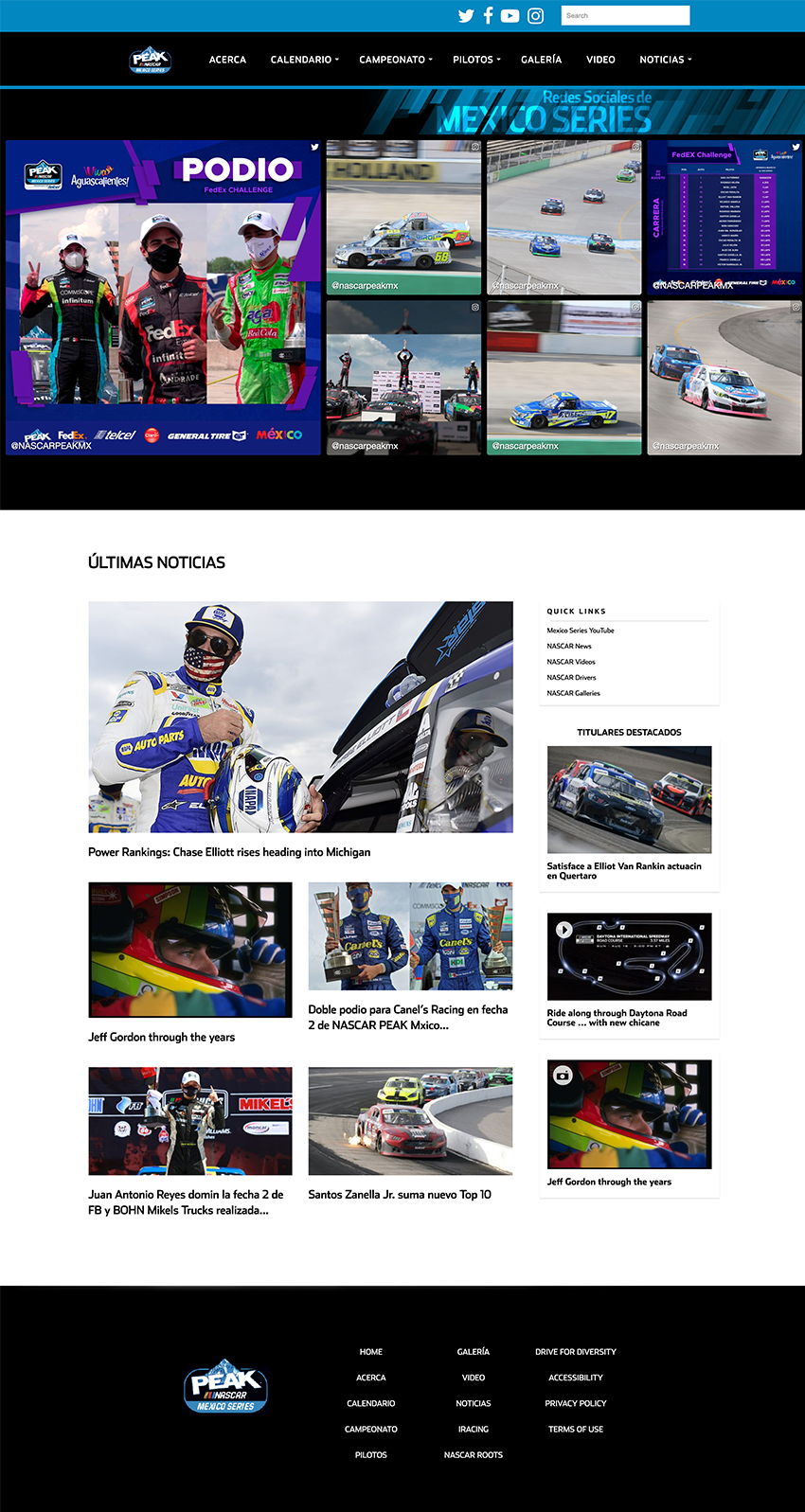
NACAR Mexico's New Website
Key Takeaways
My work with NASCAR involved balancing technical expertise with cross-functional collaboration to deliver high-quality digital experiences. By bridging the gap between design and development, I ensured that all projects met NASCAR’s high standards for performance, usability, and accessibility.
The successful launch of three major websites and enhancements to existing platforms demonstrated my ability to adapt to complex technical frameworks and high-pressure environments. Ultimately, my contributions supported NASCAR’s mission to provide engaging digital experiences for fans and stakeholders alike.
Feb 01 2020
Wick: Entertaining Well-being Science Education
I performed roles of product designer, user researcher, UX/UI designer, and developer.
Wick is a mobile app designed to make the journey of improving well-being a comforting and enjoyable adventure.
Achieved a 100% user approval rating
Identified and capitalized on a niche with little to no competition
Challenges
Learning and applying the science of well-being is often a time-consuming and confusing process. Users must absorb complex subject matter and track multiple goals, which can feel overwhelming and discouraging. Existing solutions lacked engaging methods to teach well-being science while motivating users to take actionable steps.
My Approach
To address these challenges, we conducted a comprehensive SWOT analysis of 25 competing apps in the health and wellness space. This analysis highlighted gaps in gamification and the repetitive interactions that users found disengaging.
To better understand our audience, we conducted phone interviews, collecting both quantitative and qualitative data, such as current app usage, likes and dislikes, and interest in our mission. Using these insights, we created user personas representing adults aged 19–40 at various stages of their well-being journeys.
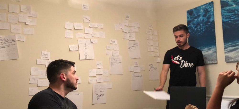
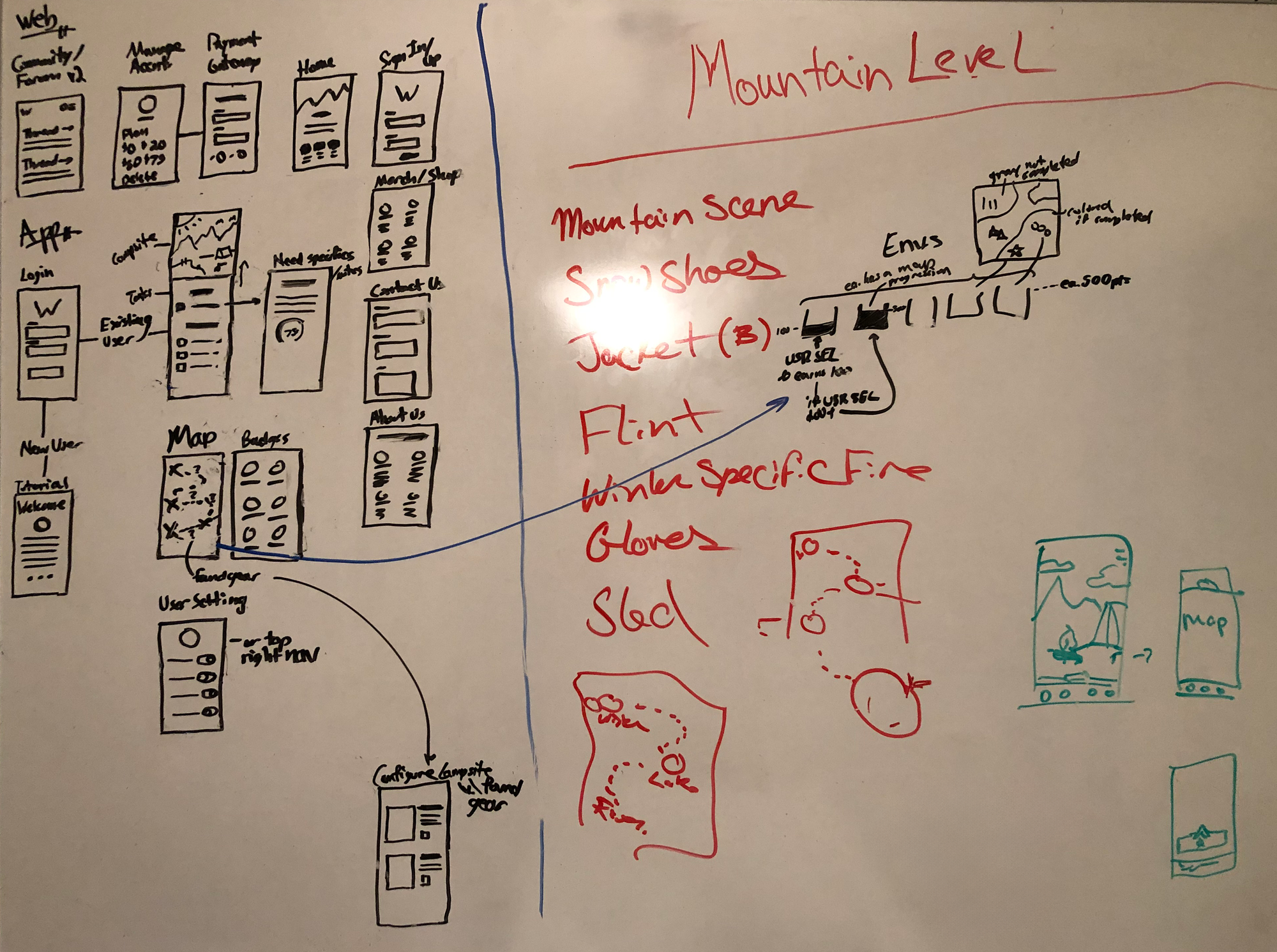
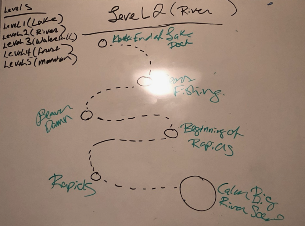
We also conducted card sorting and ideation sessions to determine the app’s core features and user flows.
Card Sorting Session
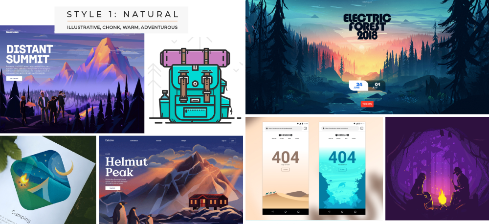
Mood-boarding exercises established the app's visual tone, while whiteboarding sessions helped us design workflows and wireframes that catered to all personas. These efforts guided branding decisions, ensuring Wick would feel like a supportive companion on the well-being journey, incorporating nature-inspired aesthetics and a comforting fire motif into its logo and design system.
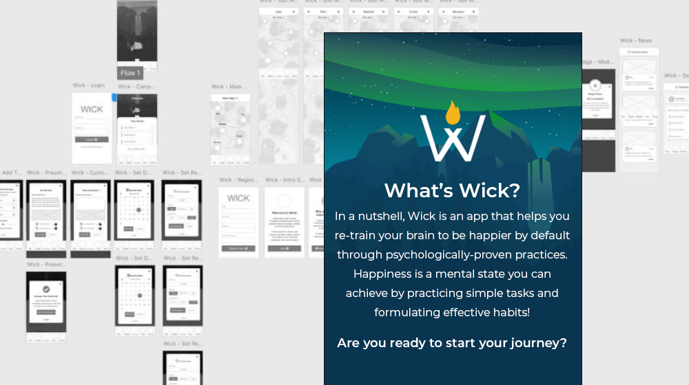
Our design process started with wireframes based on whiteboard designs, followed by the development of a lo-fi prototype to test the app's core features.
Lo-fi Screenshot
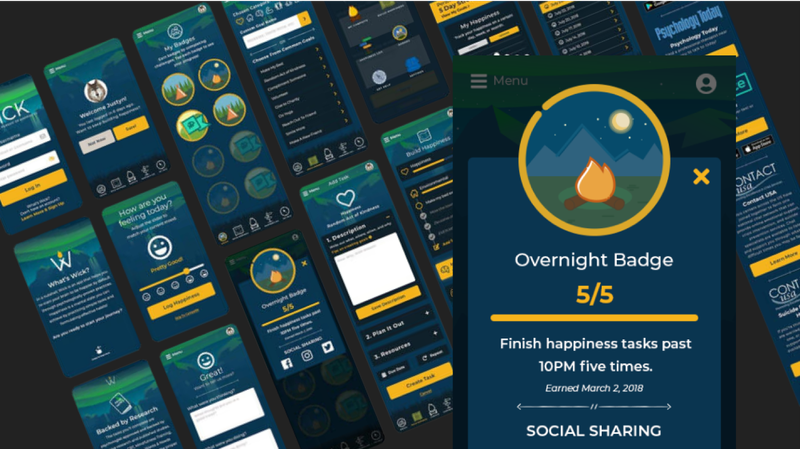
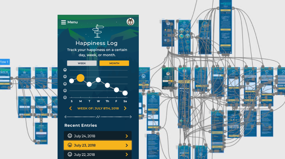
User feedback revealed valuable insights, including pain points and opportunities for improvement, which were addressed in the hi-fi prototype. The hi-fi design incorporated all user states identified during testing and brought the app’s visual language to life. The app’s journey-based format, combined with gamified tasks, resonated strongly with users during testing.
Wick's gamified structure rewarded users for completing tasks, with rewards weighted based on task difficulty to encourage progression. Points, badges, and other elements fostered a sense of achievement while breaking down complex well-being science into manageable steps. The app’s empathetic tone and adventure-inspired visual language created a welcoming and motivating user experience.
Hi-fi Prototype
Key Takeaways
Wick successfully transformed the complex science of well-being into a digestible, gamified experience that users loved. By combining user-centric design with gamification and empathetic communication, the app stands out in the crowded wellness space. With a 100% approval rating, Wick proved to be an engaging, supportive tool for improving well-being, setting a high standard for innovative, user-centered solutions in the industry.
Achieved 50% ROI. I addressed inefficiencies by designing and developing a new system that would standardize and automate processes, ensuring consistent quality and compliance while improving task efficiency.
Automotive Management Services Inc. (AMSI) manages all digital advertising for its car dealership clients, spanning major brands from Aston Martin to Volvo. The company faced significant challenges in managing and creating website add-ons, display ads, and email campaigns due to the lack of a project management system and frequent issues with compliance, accessibility, and coding errors.
Increased task efficiency by 400%
Reduced accessibility, compliance, and coding issues by 90%
Challenges
AMSI's workflow was a bit chaotic, with no project management system in place to streamline operations. Digital assets, including webpages, email campaigns, and ads, often suffered from errors in coding, accessibility, and responsiveness, leading to potential penalties for OEM compliance violations.
Additionally, long development times and a lack of integration between teams created bottlenecks, impacting the delivery and quality of assets. AMSI needed a centralized system to manage projects, track performance, and ensure compliance across all deliverables.
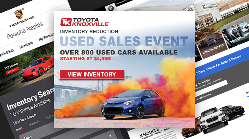
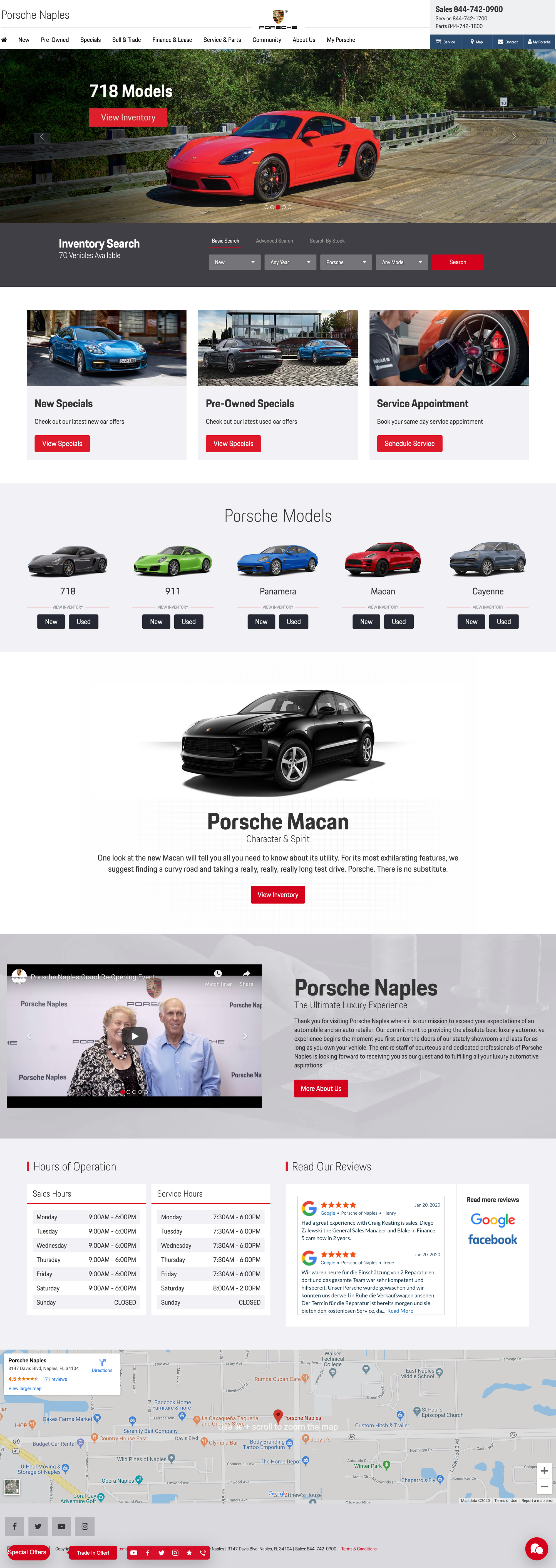
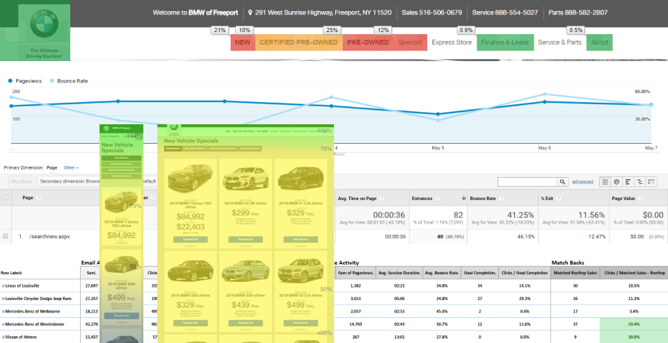
Porsche Naples Homepage
My Approach
To tackle these challenges, I began by conducting extensive research into the functions of every role within the agency. This allowed me to identify pain points and gaps in the workflow. Based on these findings, I conceptualized and designed "Phalanx," a comprehensive system to build, track, and optimize digital assets. Phalanx featured drag-and-drop functionality, real-time analytics integration, and error-free, OEM-compliant code generation, addressing AMSI's core inefficiencies.
Collaboration with account executives and OEM compliance teams was critical to understanding the specific requirements and goals of each campaign. For custom projects, I either built assets from scratch or utilized high-performing templates as a foundation. Leveraging data from tools like Google Analytics, Visual Web Optimizer, and Campaigner, I analyzed the performance of assets, identified areas for improvement, and iterated on designs to enhance effectiveness.
One of the most impactful projects was redesigning vehicle search modules for client homepages. By analyzing heat mapping and interaction metrics, we identified two distinct user groups: those with a specific make and model in mind and those with only a general idea. Through A/B testing, we implemented and optimized three variants of the module: dropdowns for year, make, and model; clickable images for body types; and a combination of both. This iterative approach ensured the module catered to diverse user preferences while improving engagement and usability.
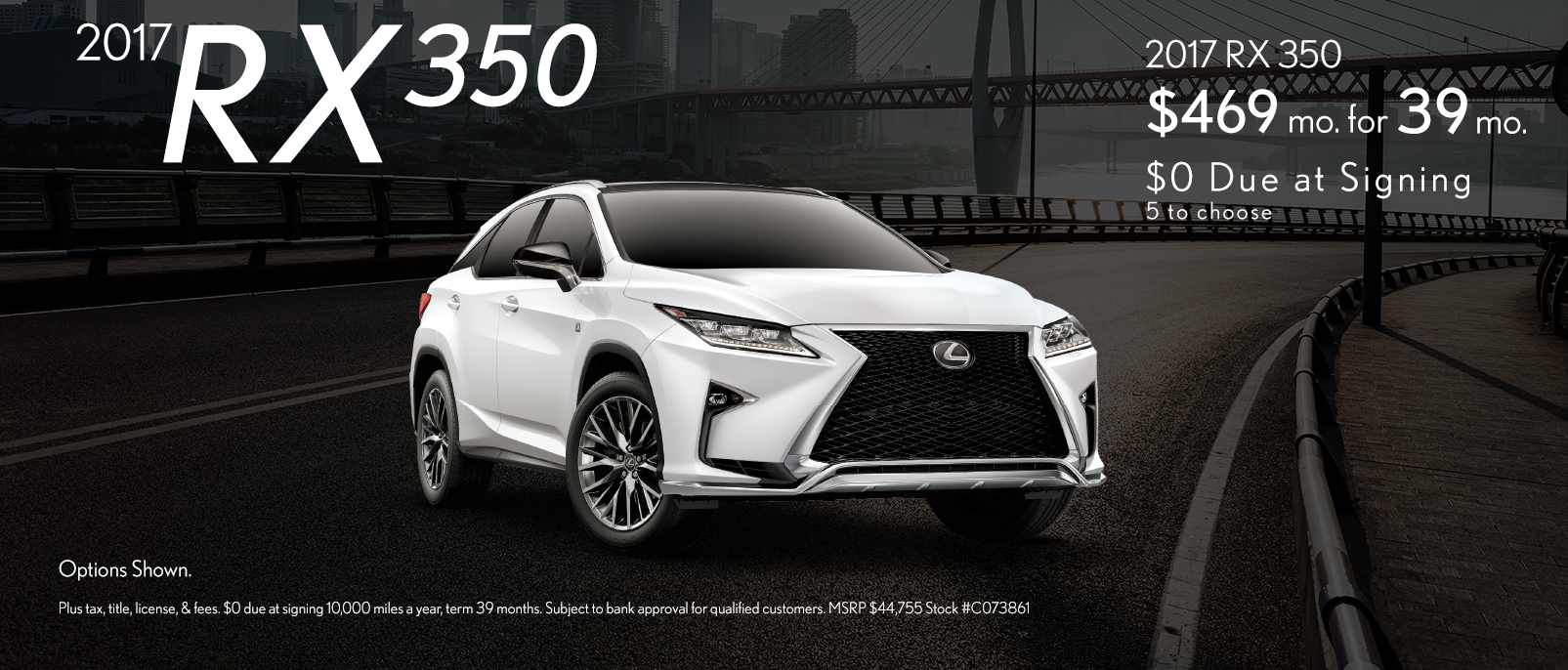
Lexus Dealer Special
Solutions
Phalanx became the centerpiece of AMSI’s transformation. Designed as a custom WordPress theme with custom plugins, it automated the generation of digital assets such as websites, email campaigns, ads, and landing pages. The system included a UI component library built with HTML, CSS, Sass, JavaScript, and PHP, enabling users to create OEM-compliant, responsive assets quickly and efficiently. Phalanx was responsible for at least 90% of the digital assets produced, with highly custom projects handled manually.
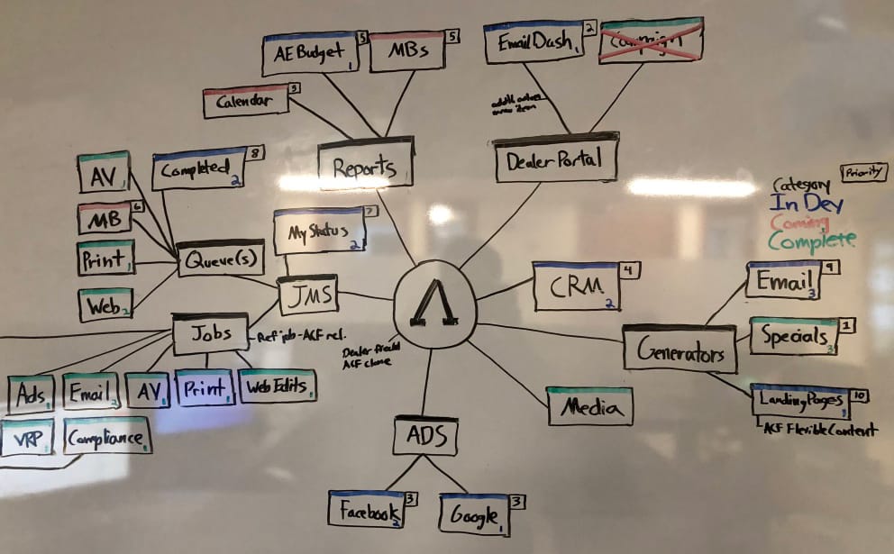
White-boarding Phalanx's Architecture
The system also incorporated job management, staff performance reporting, budget tracking, and client relationship management features, addressing broader operational gaps. User testing with SEO, email, ad, and account management teams ensured that Phalanx aligned with their daily workflows and goals. I conducted usability tests to identify pain points and refine user paths, resulting in a seamless experience for internal teams.
Additionally, I implemented rigorous testing protocols using tools like Litmus and cross-browser testing to eliminate errors in responsiveness and accessibility. Optimized templates were informed by performance data from analytics tools, ensuring assets were both effective and compliant. These changes not only reduced errors but also saved clients from potential penalties related to OEM compliance violations.
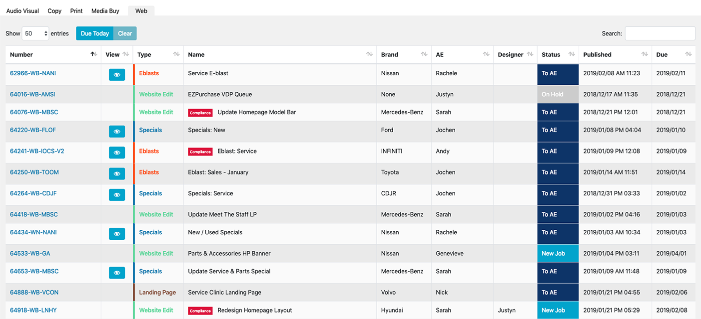
Job Management System's Queue
Key Takeaways
My work at AMSI demonstrated the power of combining user-centered design with technical innovation to solve complex organizational challenges. By developing Phalanx, I addressed inefficiencies, ensured compliance, and enhanced task efficiency by 400%. The system transformed AMSI’s digital operations, enabling the team to consistently deliver high-quality, data-driven assets. This case study highlights my ability to identify organizational pain points, design scalable solutions, and lead cross-functional collaboration to drive measurable results.